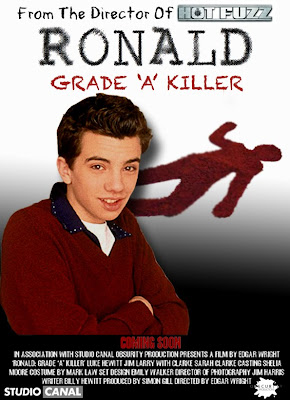
Above is potential poster idea that we could use to publicise our film, I have used all the right conventions including billing block, USP's (Director) bold images and also the title (the chosen one). I have chosen the colour scheme that I used is to signify to the audience the dark and comic area of the film. This is shown by the contrasting black and white back ground. This also shows the progression of how bad things get thought the film. I have chosen to keep the audience focus on the character who is dominating the poster. I have done this to signify the main character that this film is focused on thought the move. The dead body silhouette is used to high light possible story narrative that will be featured in the film. Overall I like the outcome of this poster and I believe I would be successful if it was used.
No comments:
Post a Comment